

- 🛠️ Build It
- 1️⃣ Data Table
- 📊 Stacked Bar
- ✨ The Magic Step
- 📅 Fix the Date Axis
- 📈 Progress Split
- 🔧 Troubleshooting
- ⬇ Practice File
- 💬 Comments
A Gantt chart is one of the most effective tools for project planning and management. It turns a list of tasks into a horizontal timeline, so you can see at a glance what runs when, what overlaps, and whether the schedule still holds.
Excel has no built-in Gantt chart type. What it has is a Stacked Bar Chart, and with one formatting trick — making the first data series invisible — that chart becomes a Gantt chart. This guide walks through the whole build, from a blank sheet to a finished timeline with progress bars and milestone markers.
If you’d rather enter your tasks and be done, our free templates build the timeline automatically with conditional formatting — no chart setup at all.
Get the Free Gantt Chart Excel Templates
How to Create a Gantt Chart in Excel
Steps 1 to 5 get you a working Gantt chart. Steps 6 to 8 are the formatting that makes it look like the ones you’ve seen in real project plans.
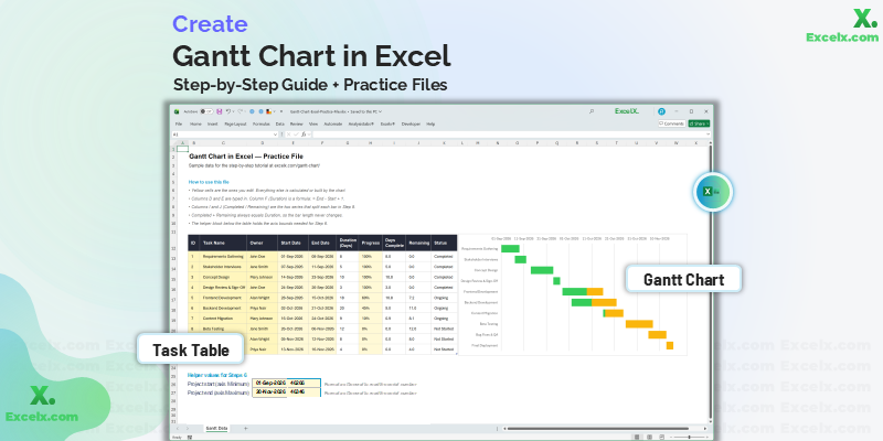
The completed chart you will build in this guide
-
Prepare Your Data TableThree columns: Task, Start Date, and Duration in days.
-
Populate the DataEnter your real tasks, owners, and progress percentages.
-
Insert a Blank Stacked Bar ChartStart from an empty chart and add the Start Date series and task labels by hand.
-
Add the Task Duration SeriesThis second series becomes the visible timeline bars.
-
Reverse the Order and Hide the Start BarsThe single step that turns a bar chart into a Gantt chart.
-
Fix the Date Axis BoundsRemoves the large empty gap before your first task.
-
Delete the Legend and Widen the BarsTwo changes that account for most of the visual polish.
-
Show Progress by Splitting the BarReplace Duration with Completed and Remaining segments, and colour by status.
-
Troubleshoot Common ProblemsDates showing as numbers, bars upside down, nothing plotting.
Step 1: Prepare Your Data Table
A Gantt chart needs three columns: Task Name, Start Date, and Duration in days.
Two things to get right before building the chart, because both are painful to undo later:
If your dates sit left-aligned in the cell by default, Excel is treating them as text and the chart will not plot them. A genuine date right-aligns automatically. Retype one to check.
Select your data and press Ctrl + T. New rows added later then flow into the chart automatically, instead of forcing you to re-select the chart range each time.
Building a Gantt Chart with Start and End Dates
Most project plans record a start date and an end date, not a duration. Excel’s stacked bar chart can’t use an end date directly — it needs to know how long each bar is, not where it stops. So add a Duration column and calculate it:
= End_Date - Start_Date + 1The + 1 is there so the start day itself is counted — a task running the 1st to the 5th is five days, not four. Leave it out and every bar renders one day short.
To count working days only and skip weekends, use NETWORKDAYS instead:
= NETWORKDAYS(Start_Date, End_Date)Add a third argument pointing at a list of holiday dates to exclude those too: =NETWORKDAYS(Start_Date, End_Date, Holidays_Range).
Keep both columns in your sheet. End dates stay readable for anyone reviewing the plan, and the duration column feeds the chart.
Here is the sample project we’ll build throughout this guide — a ten-task website redesign:
| Task | Start Date | Duration (Days) |
|---|---|---|
| Requirements Gathering | 2026-09-01 | 8 |
| Stakeholder Interviews | 2026-09-07 | 5 |
| Concept Design | 2026-09-14 | 10 |
| Design Review & Sign-Off | 2026-09-24 | 3 |
| Frontend Development | 2026-09-28 | 18 |
| Backend Development | 2026-10-02 | 20 |
| Content Migration | 2026-10-16 | 9 |
| Beta Testing | 2026-10-26 | 12 |
| Bug Fixes & QA | 2026-11-05 | 8 |
| Final Deployment | 2026-11-13 | 4 |
Notice that Frontend and Backend Development overlap. That’s deliberate — overlapping bars are exactly what a Gantt chart exists to reveal.
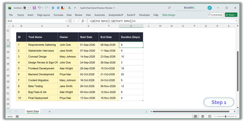
Duration is a formula: End Date minus Start Date plus one
Step 2: Populate the Data
Enter your real tasks and dates. You can add extra columns — Responsible Person, Progress %, Status — and they won’t interfere with the chart. Only the columns you explicitly select become chart series; the rest simply live alongside as your tracking log.
Keep tasks at a consistent level of detail. Mixing three-week phases with two-hour jobs in the same list produces a chart where the short bars are invisible.
| Task | Responsible | Start Date | Duration | Progress | Status |
|---|---|---|---|---|---|
| Requirements Gathering | John Doe | 2026-09-01 | 8 | 100% | Completed |
| Stakeholder Interviews | Jane Smith | 2026-09-07 | 5 | 100% | Completed |
| Concept Design | Mary Johnson | 2026-09-14 | 10 | 100% | Completed |
| Design Review & Sign-Off | John Doe | 2026-09-24 | 3 | 100% | Completed |
| Frontend Development | Alan Wright | 2026-09-28 | 18 | 60% | Ongoing |
| Backend Development | Priya Nair | 2026-10-02 | 20 | 45% | Ongoing |
| Content Migration | Mary Johnson | 2026-10-16 | 9 | 10% | Ongoing |
| Beta Testing | Jane Smith | 2026-10-26 | 12 | 0% | Not Started |
| Bug Fixes & QA | Alan Wright | 2026-11-05 | 8 | 0% | Not Started |
| Final Deployment | Priya Nair | 2026-11-13 | 4 | 0% | Not Started |
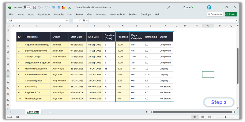
The full data set, including the helper columns used in Step 8
Step 3: Insert a Blank Stacked Bar Chart
It’s tempting to select the Task and Start Date columns and insert the chart from there. Don’t. Excel guesses how to interpret a selection, and with an Excel Table it frequently guesses wrong — pulling the ID column in as a data series, or plotting tasks along the wrong axis. You then spend longer undoing its assumptions than building the chart by hand.
Start empty instead and tell Excel exactly what goes where.
- Click any blank cell well outside your data — nothing selected from the table.
- Go to Insert > Bar Chart > Stacked Bar. An empty chart frame appears.
- Right-click inside the empty chart and choose Select Data.
- Under Legend Entries (Series), click Add. For Series name click the “Start Date” header cell; for Series values select the ten start dates only, without the header.
- On the right, under Horizontal (Category) Axis Labels, click Edit and select your ten task names — again, no header.
- Click OK.
You should now see one set of bars, all running from the left edge, with the task names down the side. That’s correct at this stage — the start-date bars become invisible spacers in Step 5.
The dialog calls them horizontal because that’s where categories sit on a column chart. A bar chart is a column chart rotated 90°, so in your Gantt chart those labels run down the left-hand side. The naming is confusing, but the field is the right one.
Use Stacked Bar — not Clustered, which puts the two series side by side instead of end to end, and not 100% Stacked, which rescales everything to percentages and destroys the timeline.
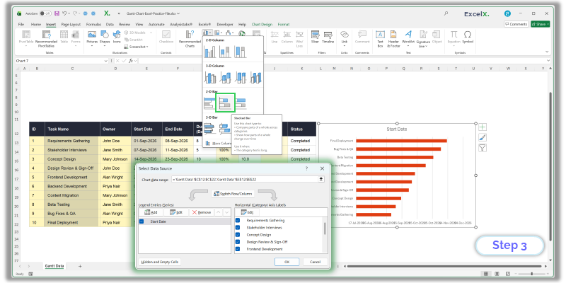
Insert > Bar Chart > Stacked Bar, then add the Start Date series and task labels by hand
Step 4: Add Task Duration to the Chart
Now add the second series — the one that becomes the visible bars. Same dialog as before:
- Right-click the chart and choose Select Data.
- Under Legend Entries, click Add again.
- For Series name, click the “Duration” header cell.
- For Series values, select the ten duration numbers — not the header.
The axis labels you set in Step 3 carry over. You only ever set those once.
Duration must sit below Start Date in the series list. Because you added Start Date first, it should already be correct — but check, and use the up and down arrows to reorder if not. Get this backwards and the wrong series ends up invisible in the next step.
You can add the Days Complete and Remaining series here instead of Duration, and skip the swap in Step 8. Set up those two helper columns first — the formulas are in Step 8 — then add them as two series in place of Duration. Everything from Step 5 onwards works the same either way; the only difference is one bar per task or two segments.
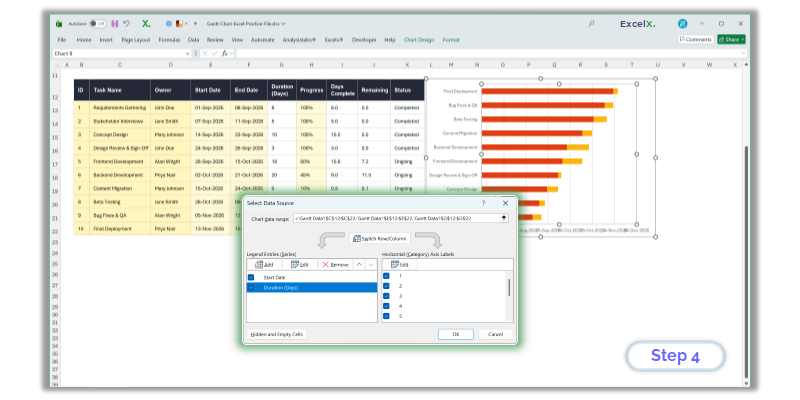
Duration is added as a second series, below Start Date
Step 5: Reverse the Order and Hide the Start Date Bars
This is the step that turns a bar chart into a Gantt chart.
- Reverse the task order. Right-click the vertical axis showing task names, choose Format Axis, and tick Categories in reverse order. Excel plots categories bottom-up by default, so your first task starts at the bottom; this flips it so the project reads top to bottom.
- Make the start bars invisible. Click any bar in the first series — the one anchored to the left edge. Right-click, choose Format Data Series > Fill > No Fill, and set Border to No Line as well.
The start-date bars are still there, holding each task’s position on the timeline. They’re just transparent, and that’s what creates the staggered Gantt effect.
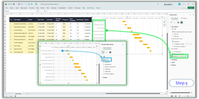
No Fill on the Start Date series plus reversed category order creates the Gantt layout
Step 6: Remove the Empty Gap Before Your First Task
Your chart works now, but a large blank space probably sits on the left before the first bar. Excel starts the date axis at zero — 1 January 1900 — so it’s plotting more than a century of nothing.
To fix it you need your project’s start date as a serial number:
- Click an empty cell and enter your earliest project start date (here, 2026-09-01).
- Format that cell as General. The date becomes a five-digit number. That’s Excel’s internal date serial.
- Right-click the horizontal date axis and choose Format Axis.
- Under Bounds, set Minimum to that number.
- For Maximum, use your latest end date plus one day — 2026-11-17 in this example. See the note below for why.
Each bar is drawn as Start Date plus Duration. Because Duration is calculated as End - Start + 1, the bar’s right edge lands one day past the end date. Set the maximum to the plain end date and your last bar gets clipped. In the practice file this is handled for you: =MAX(End Date)+1.
It’s tempting to write =MAX(End Date + Duration) to be safe. That overshoots by the length of the longest task — on a plan with a 60-day phase you’d add two months of empty timeline, which is the very thing this step exists to remove.
The timeline now spans only your project. Under Units, set Major to 7 for weekly gridlines or 1 for daily.
Setting bounds manually resets the number format. Open Number in the same Format Axis panel and choose a date format such as dd-mmm.
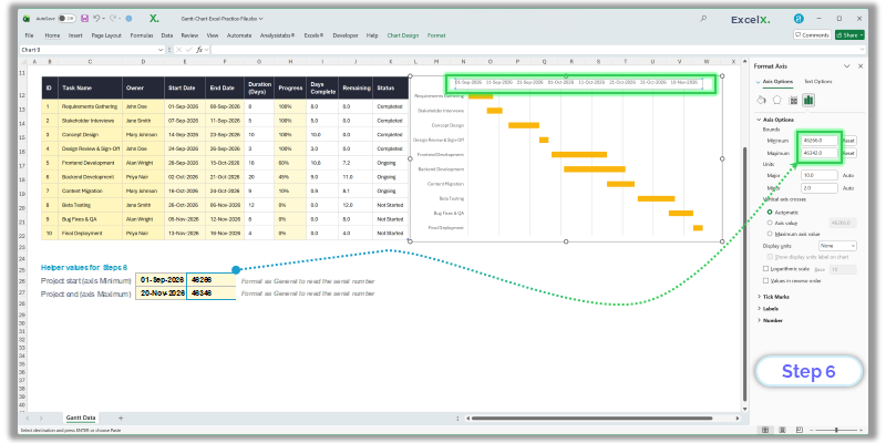
Setting axis bounds removes the empty space before the first task
Step 7: Delete the Legend and Widen the Bars
Two quick changes account for most of the visual difference between a rough chart and a finished one:
- Delete the legend. It only names “Start Date” and “Duration,” and one of those is invisible. Click it, press Delete.
- Widen the bars. Right-click any visible bar, choose Format Data Series, and drag Gap Width down to roughly 20–40%. Excel’s default of 150% leaves thin bars floating in white space.
While you’re in Format Data Series, set the bar fill to a single flat colour rather than Excel’s default gradient — one colour reads better across a long timeline. Add a chart title, and turn on vertical gridlines under Chart Elements > Gridlines so bars can be traced back to dates.
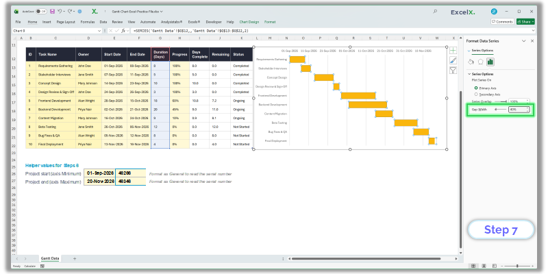
Lower Gap Width thickens the bars; the legend is deleted
Step 8: Show Progress by Splitting the Bar
The chart you have now shows each task as one solid bar of its full duration. That’s fine if all you need is the schedule. To show how far along each task is, you split that single bar into two coloured segments — work done and work remaining — which stack end to end and add back up to the full duration.
If you took the shortcut at the end of Step 4 and already added Days Complete and Remaining, your bars are split already. Skip to the colouring note below.
In a stacked bar chart every series sits end to end, so adding a “days complete” series on top of Duration makes each bar too long by that amount. Series Overlap won’t fix it — that setting only applies to clustered charts. Replacing Duration with two segments is the approach that works.
Add two helper columns beside your data:
Days Complete = Duration * Progress
Remaining = Duration - Days Complete| Task | Duration | Progress | Days Complete | Remaining |
|---|---|---|---|---|
| Requirements Gathering | 8 | 100% | 8.0 | 0.0 |
| Concept Design | 10 | 100% | 10.0 | 0.0 |
| Frontend Development | 18 | 60% | 10.8 | 7.2 |
| Backend Development | 20 | 45% | 9.0 | 11.0 |
| Content Migration | 9 | 10% | 0.9 | 8.1 |
| Beta Testing | 12 | 0% | 0.0 | 12.0 |
Days Complete plus Remaining always equals Duration, so the total bar length never changes — you’re only dividing it.
Now swap the series:
- Right-click the chart and choose Select Data.
- Select the Duration series and click Remove.
- Click Add. Series name: the “Days Complete” header. Series values: the ten Days Complete figures.
- Click Add again. Series name: the “Remaining” header. Series values: the ten Remaining figures.
- Check the order top to bottom reads Start Date → Days Complete → Remaining. Use the arrows to fix it if not.
- Click OK, then colour the two series: a solid dark shade for Days Complete, a lighter tint of the same colour for Remaining.
Each bar now reads as a progress bar in place — the dark portion is finished work, the pale portion is what’s left. A fully complete task shows as solid dark; a task not yet started shows as entirely pale.
Days Complete must come before Remaining, or every bar will show its progress fill at the wrong end. And both must sit below Start Date, which stays invisible from Step 5.
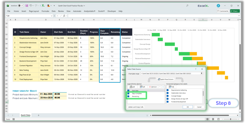
Duration is replaced by two series that stack back to the same length
Colouring Individual Bars by Status
To make one task stand out — an overdue phase, a blocked task — colour that bar alone rather than the whole series. Click once on a bar to select its series, then click again on the same bar to select just that data point. Right-click, choose Format Data Point, and set the fill.
Apply this to the Remaining segment, since that’s the part that signals unfinished work. Red on a task whose end date has passed reads immediately as slipped.
Excel charts have no conditional formatting for bar colours — data point fills are set by hand and don’t update when status changes. On a ten-task plan that’s a minute’s work. On a plan you re-colour every week, the cell-based method covered further down handles this automatically.
Step 9: Troubleshooting Common Problems
Format Axis on the vertical axis, tick “Categories in reverse order.” Excel plots the first row at the bottom by default.
Format Axis > Number, choose a date format. Setting axis bounds manually resets the number format.
Your start dates are text, not dates. Text left-aligns by default; a real date right-aligns. Select the column and use Data > Text to Columns > Finish to convert them all at once.
The series are in the wrong order. Open Select Data and move Start Date above Duration.
This happens when the chart is inserted with data cells selected — Excel picks up the ID or Progress column as a series of its own. Delete the chart and start again from a blank cell, adding each series by hand as described in Step 3.
The category axis labels were never set. Open Select Data, and under Horizontal (Category) Axis Labels click Edit and select your task name cells.
The source range is fixed. Convert the data to an Excel Table with Ctrl + T and the chart follows new rows automatically.
Set the axis Maximum bound to your project’s last end date, as described in Step 6.
Practice File for This Tutorial
One workbook with everything in it: the ten-task data set, the Duration, Days Complete and Remaining formulas already written, the axis bound helpers from Step 6, and the finished Gantt chart. Follow along on your own copy, or open the chart and click through its settings to see how each step was applied.
Delete the chart from the downloaded file and start at Step 3. The data and helper formulas stay in place, so you can rebuild the chart as many times as you like without retyping anything.
Two Ways to Build a Gantt Chart in Excel
The stacked bar method in this tutorial is one of two approaches, and they behave quite differently once a project is actually running.
The chart method — what you’ve just built — produces a genuine Excel chart object. It’s the right choice when you need to paste the timeline into a slide deck or report, or when you want a graphic that scales cleanly at any size. The cost is that every change means going back into chart settings, and adding a task can mean re-checking axis bounds and series ranges.
The conditional formatting method uses coloured worksheet cells instead of a chart. Each cell in the timeline grid tests whether its date falls inside a task’s window and fills itself if so. Nothing to reformat when you add rows, no axis bounds to reset, and the whole plan stays editable as a normal spreadsheet. The trade-off is that it isn’t a chart object, so it doesn’t copy into PowerPoint as cleanly.
What the Chart Method Can’t Do
Two things are worth knowing before you commit to building charts for every project.
Milestone markers. Excel won’t combine a horizontal bar chart with a scatter series — bar is the one chart type excluded from combo charts. So the usual trick of overlaying diamond markers isn’t available here. The workaround is to give each milestone its own row with a duration of zero or one day and colour that bar differently, which works but takes a row rather than sitting on the timeline as a marker.
A “today” line. For the same reason, there’s no dynamic way to draw a vertical line at the current date. You can position a line manually with Insert > Shapes, but it won’t move on its own — you’d reposition it every time you open the file.
Both are straightforward with the cell-based approach, where a column can simply test =TODAY() and shade itself.
For a plan you’ll update weekly, conditional formatting is usually less work over time. For a one-off timeline that needs to look polished inside a document, build the chart.
If setting up these axis bounds and formatting rules is taking longer than the project itself, you can skip the manual build entirely — our pre-configured, macro-free Simple Gantt Chart Excel Template already has the timeline logic, progress tracking and milestone markers in place.
Want the conditional formatting version without building it?
Our free Gantt chart Excel templates use exactly that method — enter a start date and duration and the bars appear, with progress tracking and milestone markers already set up. Eleven layouts covering hourly through 24-month timelines, no macros required.
Found this guide useful, or got stuck on a step? Let us know in the comments.